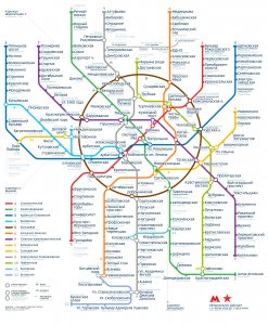
 In the new version of the scheme, a breakthrough is made in the aesthetic and the text is significantly increased:
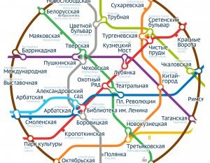
The left part of the scheme doesn't look like a ugly shelf of appendice. The Scheme uses a much more rational area.
The area inside the ring line is filled with stations most uniformly:
The scheme has become easier, more graphic and more technological. Shadows got rid of the washing, the transitions from gradients.
Special attention is paid to the transition plate:
P.S. Sands is specially adapted to be used in the scheme - the difference in height of the rigid and capital letters is reduced, so that the hard-wrapped multiple names look carefully:
The achievements of the previous version of the scheme: victory over Lenin's Library, simplicity and unambiguousness in the image of transplants, lack of text and graphic debris working without the grid alphabetical index, accessibility for people with colour problems.