
History of Moscow Metropolitan
The Moscow subway has undergone many changes, reflecting not only the mutual location of the lines, but also the features of the fashion and design that characterize the different periods of our country ' s history.
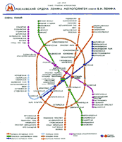
First line
The diagram is taken from the 1935 edition of the Truda. In the lobby, there were other schemes, "straight down," which appeared in some photographs of the 1930s.
By 1954, there are black-white schemes in the wagons. All the lines are black, the pattern is close to the right mapping of lines and stations.
The design of the scheme subsequently changed very little. Changes were limited to a bunch of new sites. By 1958, lines are displayed in different colours. That is the colorful decision that has come to no change to our days. It should be noted that in all the subways of the cities of the former USSR, the first line is always red, the second is blue (low green) and the third is green or blue, respectively.
Note that on the 64-year pattern, the Kaluz and Rije radius do not form one line and even show different colours! The fact is that only the extension of lines and the construction of new radius from the Koltese Line stations were planned during this period, without radius connections in diameter through the centre of the city. Only then was the decision found to be incorrect, and the construction of the central section formed the Kaluzco-Rijian Line.
Cardinal design changes in the early 1970s. Going back to the past, smooth bending lines. Now it's simplicity, clarity and speed. The ring line is first portrayed as the right circumference and the radius is straight lines. There was a change in the image of the subway logo, the styled letter "M." If there are still gaps on the Tagansk-Krasnoprosne line in the 1970s scheme, all lines are portrayed directly by the end of the decade without angles and fractures.
Since 1979, new lines have emerged in the wagons. Now the Roll Line is two semi-districts connected with vertical straight. The lines are becoming more smooth again.
The stations in the peripheral part of the city are now portrayed as close to each other.This decision has increased the size and visibility of the central part of the scheme where the topology of the network is most complex.
At the same time, the current logo of the Moscow Metropolitan Metropolitan is the stylized "M" red in the circumcised blue circumference, which reminds the shape of the tunnel.
1979 Schemefrom the Moscow Encyclopedia of 1980.
However, this option did not last long. New diagrams are emerging from the first section of the Serpukovsco-Timirazev line. The ring line is again drawing the right circumference, and stations outside the central part are not attached to each other. The lines are initially portrayed as lambs, but later replaced by more stubborn.
With the opening of the extension of the Kaleus radius in 1987, the design of the schemes changed again. There's a Timirazev and Ljullin radius on the scheme. All lines were now sent horizontally, vertically or 45 degrees. The only exception, the Ring Line, kept its spell as the right circumference. Differentially changing the details, but maintaining the basic composive principles, the design survived until September 2003.
The latest versions of the scheme have removed the plots under construction, and all the names of the stations are produced by the Latin.
In a scheme called the Moskva Passenger Lines Scheme, the light metro lines in South Butowo and Sunnivo, the line of monorels from the Timirazev Station to the NDA. Arbatsk-Paudian and Ljulinsky-Dmitrov sections are shown. The truth is, somehow, there's no sign of the MMD line Moscow City and the southern extension of the Ljullin radius.
According to the metropolitan authorities, for passenger convenience, the lines are approaching reality, the lines themselves have become thin. But it's a disputed decision. Close to real scale has led to a decrease in the central part, the most complex section of the scheme where most of the lines are located. This, in turn, led to the need to reduce the size of the prints in the names of stations. The scheme became difficult to read, especially at a distance.
In my view, the main task of the wagon scheme is to correctly transmit the topology of the network, not the scale. In this case, distortion of scale is a more than just assignment in the name of convenience and easy reading. It's not just young people, but older people, it's not all the perfect vision. It must be borne in mind that it is not for all passengers that Russian is their mother tongue, but that it is difficult to read petty writings in a foreign language, and in a very uncomfortable situation, the moving wagon is much more complicated. A (almost) large-scale circuits hang in the lobby where they can be approached closely and carefully.
In addition, the design of the scheme was, in a mild way, borrowed from a well-known site on the world's metropolitans, created by Robert Schwandle. Partial lines have been altered, but some specific locations (e.g. the bend of the Socoln Line at the Sports Line) give the "head" kinship to the original. The added Moskva Reka and Yausa are not shown in the style of the scheme (the discontinuity of the directions is not respected).
The scheme has caused many requests from passengers. Moscow complained that the writings were difficult to read, because of the narrowness and the indivisibility of the lines, it was difficult to understand the topology of the network, especially in the complex central part. The experiment was found to be a failure and a new version of the wagon scheme was presented at the end of 2003.
From the previous version, the new diagram inherited the name, the Moskva Rapid Transport Lines Scheme, the image of Moscow of the River and Yaus. In general, however, there has been a return to the traditions of Moscow wagons. The ring line is portrayed by the right circumference, the lines are straightened and thicker. Because of the expansion of the central part, the scheme has ceased to be large, but the intersections between the stations in the peripheral part of the city are left behind, which retains the kind of geography.
The new diagram shows the logo of the light metro and the mono-rail transport system, the only line of which is marked as operating, although at the time of the diagram, the date of opening is not yet known and the launch is not expected until January 2004. In addition, the diagram shows a mini-metre line, which begins with the Kiev line, although the movement of mini-meter trains will in fact be combined with the Philly Line on the Alecsandrov Sad section - Kievsky.
Interesting designer solution for the future inclusion of the Philly Line section in the Arbatco-Porodian. The places of future connection are marked by arrows.
End 2003 Wagon SchemeHowever, the new scheme has not been flawed. The chosen image style of stations and, in particular, transplant knots made a saturated pattern of excessive contrasting details, causing irritation and cutting eyes. It is not clear why the successful, intuitive and calm decision of the 2001-2003 model should have been abandoned.


